# Styling
NOTE
This documentation is the same for both the customer and clerk applications.
Design prototypes
See the design prototypes in Figma here
# Base Components
If you find yourself adding something that is used throughout the application (e.g. a new styled button) rather than having it confined to one screen or one location, consider making it into a base component as to reduce repetitive code/importing from different locations.
Customer PR #28: Base Components (opens new window)
# Buttons
ButtonLabel: Used to add text to button containersButtonContainer: A sized TouchableOpacity// Source: WelcomeScreen.js <ButtonContainer onPress={async () => this.guestLogin()}> <ButtonLabel style={{ textTransform: 'none' }} color={Colors.primaryGreen}> Continue without an account </ButtonLabel> </ButtonContainer>FilledButtonContainer: Rounded button that is green by default, but color props and rounding can be passed in.<FilledButtonContainer color={Colors.lighterGreen} width="100%" onPress={() => this.navigateLogIn()}> <ButtonLabel color={Colors.lightest}>Log In</ButtonLabel> </FilledButtonContainer>SquareButtonContainer(clerk app only): is a 54px by 54px square button// + button in RewardModal.js <SquareButtonContainer activeOpacity={max ? 1 : 0.2} color={max ? Colors.lightestGreen : Colors.darkerGreen} onPress={() => max ? this.showError(true) : this.updateRewardsApplied(true) }> <BigTitleLabel>+</BigTitleLabel> </SquareButtonContainer>
# Navigation Headers
NOTE
Navigation headers are only used in the customer app.
All navigation headers use a NavHeaderContainer, but the NavButtonContainer and NavTitle are optional. The NavHeaderContainer can contain other components (see Store List Example)
# NavButtonContainer
Used as navigation buttons, seen as the back buttons and hamburger button throughout the app.
# NavHeaderContainer
Container with shadows for most screens. For example, rewards and resources use differently styled headers which is created by passing in the background color, margin, height, and shadow for the header.
# Props
| Name | Type | Description |
|---|---|---|
| backgroundColor | string | The background color of the header container. Defaults to Colors.lightest which is #ffffff white. |
| withMargin | boolean | If true, the header container will have a 16px bottom margin. Defaults to false so content after will be flush to the container. |
| vertical | boolean | If false, the header will expand vertically to accommodate content. Defaults to false for a horizontal flex direction. |
| noShadow | boolean | If true, the header container will not have any drop shadow. Defaults to false to include a drop shadow. |
# NavTitle
Specially styled Title for headers with centered text and appropriate spacing.
# Props
| Name | Type | Description |
|---|---|---|
| color | string | Text color of the navigation title. Defaults to Colors.activeText |
# Usage Examples
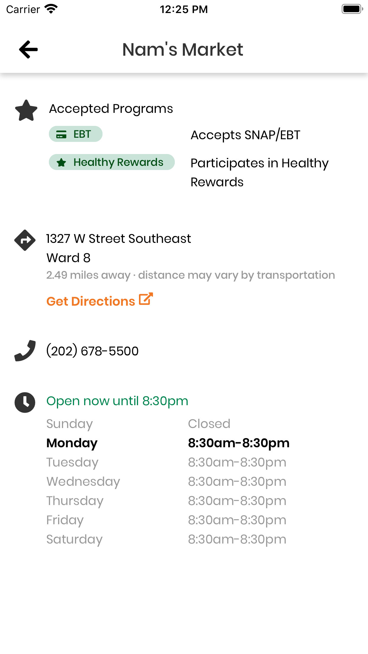
# Store Details: Standard usage
// Source: StoreDetailsScreen.js
import { FontAwesome5 } from '@expo/vector-icons';
import { NavButtonContainer, NavHeaderContainer, NavTitle } from '../../components/BaseComponents';
...
<NavHeaderContainer>
    <NavButtonContainer onPress={() => this.props.navigation.goBack()}>
        <FontAwesome5 name="arrow-left" solid size={24} />
    </NavButtonContainer>
    <NavTitle>{storeName}</NavTitle>
</NavHeaderContainer>
Result
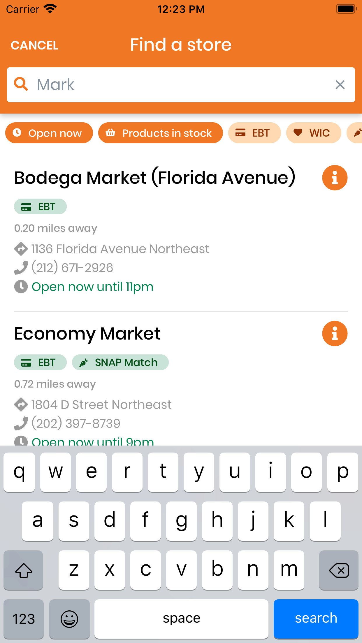
# Store List: Vertical nav header containing other components
// Source: StoreListScreen.js
<NavHeaderContainer vertical backgroundColor={Colors.primaryOrange}>
    <ColumnContainer style={{ width: '100%' }}>
        <RowContainer
            style={{
            width: '100%',
            alignItems: 'center',
            justifyContent: 'center',
            }}>
            <CancelButton onPress={() => this.props.navigation.goBack()}>
                <ButtonLabel color={Colors.lightest}>Cancel</ButtonLabel>
            </CancelButton>
            <Title color={Colors.lightest} style={{ textAlign: 'center' }}>Find a store</Title>
        </RowContainer>
        <SearchBar
            ...
        />
    </ColumnContainer>
</NavHeaderContainer>
Result
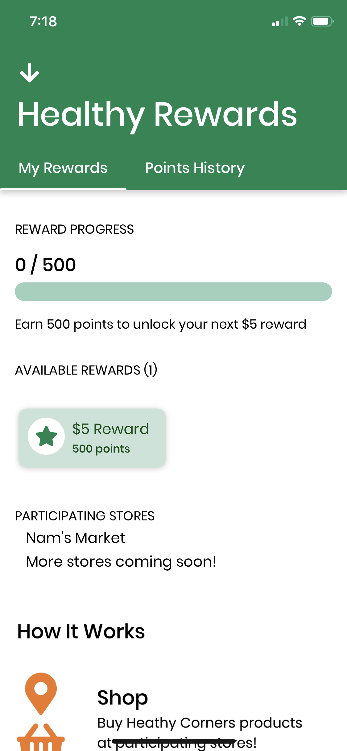
# RewardsScreen: Vertical nav header with a custom text style
// Source: RewardsScreen.js
<NavHeaderContainer vertical noShadow backgroundColor={Colors.primaryGreen}>
  <NavButtonContainer onPress={() => this.props.navigation.goBack()}>
    <FontAwesome5 name="arrow-down" solid size={24} color="white" />
  </NavButtonContainer>
  <BigTitle style={{ marginLeft: 18, color: Colors.lightest, fontSize: 36 }}>
    Healthy Rewards
  </BigTitle>
</NavHeaderContainer>
Result
Using SafeAreaProvider for notch detection
The header container detects safe area insets and adjusts the navigation heading height depending on if the device has a notch.
In order to use SafeAreaProvider to detect if the device has a notch:
- NavHeaderContainer must be a functional component
- The root component must be wrapped in SafeAreaProvider
See Expo SafeAreaContext docs here (opens new window)
Related PR: #56 (opens new window)
In the NavHeaderContainer, the topInset is calculated with useSafeArea().top, and this inset is added to the top padding to make sure the heading content is not blocked by a notch if the device has a notch.
// Source: BaseComponents.js
import { useSafeArea } from 'react-native-safe-area-context';
...
export function NavHeaderContainer({
    ...
}) {
  const topInset = useSafeArea().top;
  return (
    <View
      style={{
        ...
        paddingTop: 16 + topInset,
        minHeight: 62 + topInset,
        ...
      }}>
      {children}
    </View>
  );
}
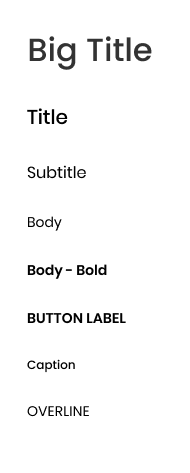
# Text Components
The following text components from BaseComponents.js are used throughout both apps.
BigTitleTitleSubtitleBodyCaptionOverline
This is how the text components are displayed. Source: component designs in Figma.
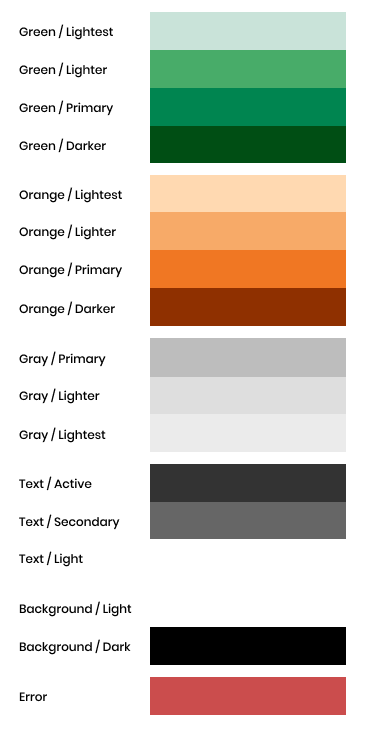
# Colors
Various colors used throughout the app have been defined in Colors.js
const Colors = {
  // Green
  lightestGreen: '#C9E3D9',
  lighterGreen: '#48AC69',
  primaryGreen: '#008550',
  darkerGreen: '#004E14',
  // Orange
  lightestOrange: '#FFD9B1',
  lighterOrange: '#F7AA68',
  primaryOrange: '#F07723',
  darkerOrange: '#8F3000',
  // Gray
  primaryGray: '#BDBDBD',
  lighterGray: '#DEDEDE',
  lightestGray: '#EBEBEB',
  // Text
  lightText: '#FFFFFF',
  activeText: 'rgba(0, 0, 0, 0.8)',
  secondaryText: '#666666',
  // Background
  bgDark: '#000000',
  bgLight: '#FFFFFF',
  // Error
  error: '#CB4D4D',
};

export default Colors;
# shared.js Containers
shared.js contains a variety of styled containers to format components. For simplicity, the names are intuitive. There are the following:
RowContainerColumnContainerInLineContainerSpaceBetweenRowContainerSpaceBetweenColumnContainerSpaceAroundRowContainerJustifyCenterContainer
We can see things like JustifyCenterContainer used to center buttons on screens such as SignUpScreen.js.Use shared/ to find components to format.
# When to create a base component/shared component
If you find yourself using a fairly styled component throughout the app (say, a fun looking button!), you should make it a base component to reduce redundant code.
If you're trying to align components in a fun way, check shared.js first, and if it's not there, add a container so that it can be reused in the future!
# Styling considerations for Android
We have run into a few issues that only appear on Android devices:
- Android does not register
box-shadow. Instead, you have to useelevation. font-weightcannot be specified in CSS for custom fonts,or it will default to Android in Roboto (source (opens new window)). However, you must specifyfontWeight: 'normal'increateDrawerNavigator- To make passwords hide in text fields on Android, the
keyboardTypemust be set toundefined